G324 Amelia Crossley

Wednesday 23 December 2009

Evaluation Part 2

In what ways does your media product use, develop or challenge forms and conventions of real media products?


Our media uses the forms and conventions of real media products as we have incorporated a 'Final Girl' into our film (Catie) which you will find in many horror films such as John Carpenters 'halloween' and Nelson McCormick's 'Prom Night'. We also used this convention of real media products because we used a stereotypical 'Final Girl' which include characteristics such as, intelligent, brunette, signs of trouble are always far more apparent to them, the 'Final Girl' usually finds the corpses of her friends which alerts her to the danger that surrounds her and she is usually seen as 'innocent', we gave our 'Final Girl' the name 'Catie' which means pure. We incorporated this characteristics within our 'Final Girl'. We used the idea of having a scream queen in our film, the stereotypical blonde female with a large chest and sexually available who is usually the first to be killed. An example of this from a real media product is the film 'Scream' featuring Drew Barrymore. Another example of a 'Scream queen' is from 'Donkey Punch' where one of the characters is a blonde female with a large chest and sexually available therefore we named our 'Scream queen' Lisa, the same name as the blonde character is 'Donkey Punch'. This binary opposition is a common convention of horror films and helps to anchor to the audience quickly and effectively. These two female stareotypes are confirmed through the images of the female central protagonist who play the finla girl in Halloween 'Jamie-Lee Curtis', and the loose blonde who plays a scream queen in Hell Night 'Jenny Neumann'. We also intertextually linked our male characters for example the popular male (Ben) who has a girlfriend and who is sporty therefore he has a 'jock' type figure,which is juxtaposed to his almost enemy (Lewis) who has a slimmer body and more 'geeky' looking appearance. We took a lot of consideration while choosing our cast and deciding what costume they should wear as we wanted to connote the ideology of the stereotypical characters shown in horror films following the tpical conventions of them
We have also used forms and conventions from films such as 'Prom Night' where the killer murders the main female protagonist's friends before he gets to her which is what we have done in our film, the killer kills Catie's friends before he reaches her, almost like the killer is getting closer and closer to her which also links into the name of our film 'Think Closer'.
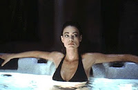
Our media product also uses forms and conventions from 'Valentine' this is when one of Catie's friends is killed in a bath and one of the characters ( Denise Richards) from 'Valentine' is killed in a hot tub, however we did develop this convention because we used a bath instead of a hot tub due to the fact we were not able to find a hot tub in time for shooting also we felt a bath would provide more verisimilitude and be further intertextually linked to the shower killing scene from ‘Psycho’. We also used a character who would look quite similar to the character that Denise Richards plays in 'Valentine'. Below is a rough cut of our killing in the bath.


Although we used many of the codes and conventions of a film teaser trailer we made a less mainstream version of a teaser trailer due to the fact that we used lots of clips in the beginning to establish the plot and communicate the genre (horror) to our audience. We were inspired by the effectiveness of the teaser trailer for the film 'Valentine'. As the more traditional teaser trailers are simple, not giving too much of the narrative away, with lots of establishing dialogue, we decided to develop this convention by using lots of shots giving the audience lots of information however theses shots were not necasarily in the right order, we did this to keep a narrative enigma but to be able to give the audience a sense of the films narrative. whilst supplementing the begining of the trailer with a voice over so the audience isnt left completly bewildered, this clip was cut up into three seperate clips which we then used in three different shots throughout the trailer. We also had a shot where the main protagonist Catie (Sarah) is talking to the girls, in a social shot which we added into the trailer after our first audience feedback. Catie (Sarah) is saying how her boyfriend (Ben) is becoming a bit paranoid and that she doesnt know what to do, this automatically seals her fate. This is a common convention of horror film teaser trailers. That a false sense of security is briefly established, enhancing the drama in the film.
We have developed a convention from the film 'Psycho' from the famous shower scene. We have developed this by having one of our killings in a bathroom, the same as 'Psycho' but we have developed this convention by the female victim having long brunette hair instead of shot blonde hair and by being in a much more vulnerable position by being in the bath rather than the shower which would make it a lot easier for the killer and to enhance a more dramatic scene.
We also used the idea from 'Psycho's famous shower scene within our logo. We did this by adding a running shower head into our logo which was symbolising flowing blood. We then used this in our poster as well as the main image was the main protagonist taking a shower with the killer stood behind her, holding a knife in his right hand. We also intergrated this into our magazine front cover as one of the still images at the bottom of the magazine front cover was of the bath scenes. This theme has been carried on through in our film teaser trailer and our ancillary tasks which will help to interlink the film teaser trailer, poster and magazine front cover.
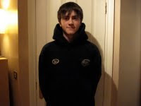
We have challenged the common conventions of horror as the stereotypical killer is usually male (apart from the few, for example Pamela Vooheers from 'Friday 13th' who is one of the most famous examples). Revenge is usually one of the main motivations of the killer, horror films usually focus on the family backgrond of the killer, an example of this is 'Halloween' which has a large focus on the Myers and Strode family. The killers are usually both physically and visually intimidating (Thomas Hewitt, 'The chainsaw massacre').They often hide their face behind a mask or have some form of deformtation (Michael Myers, 'Halloween'). We have challenged these conventions as our killer is seen to be a harmless male friend who has a geeky appearence and seen to be one of the good guys in the film trailer. We decided to do this as we wanted to create a false sense of secuirty for the audience which meant that when the killers identity was revealed, it would be a shock for the audience.
We have also challenged another convention of horror films by not including any authority figures in our film trailer. Obviously with the films focus on teenage concerns and the target audience being teenagers it is common that a teenage horror would feature parents or an authorative figure such as 'Prom Night' they featurs the main protagonists aunt and uncle. We decided to challenge this convention because its highly unlikely that all teenagers are actually that close to their parents and we wanted to focus more on the six main characters rather than thier parents/ authority figures.


Evaluation Part 4

How did you use new media technologies in the construction and research, planning and evaluation stages?

These are some of the new media technologies i have used throughout the construction and research, planning and evaluation stages:


We used a video hosting site 'Photobucket' to host our final cut as well as our rough cuts and initial sample scenes so we could then upload these clips onto our blogs. This enabled us to upload our videos and clips easy. This way of uploading videos was a lot more efficient than it was to upload videos on the old settings on blogger as it took less than a minute whereas had we been using the old settings on the blogger it could have taken up to two hours. There was also a quick upload time when we were putting our footage on 'Photobucket' which helped to make the whole process a lot quicker.
The main new media technology that i have used for the process of my project was the 'Blogger' itself. 'Blogger' enabled us to store our work efficiently and it was easy to access. 'Blogger' enabled us to upload our video clips of our rough cuts and our final cut whereas, had we been storing our work on paper we wouldnt have been able to incorporate our videos in with our actual work but 'Blogger' makes this possible for us. Aswell as typing up our notes on the blog i have also been using the tool to add links which enabled me to add links to phrases or words which would then take me to another web page which perhaps shows the reader what i'm talking about in visual rather than just writing.
Another new media technology which i have used are the search engines, websites such as 'imdb.com' and 'Wikipedia'. With these i was able to research the genre horror as well as researching different horror films, to look at casting, Directors, Release date, tagline and genre. Although i did do some research through books i found it a lot easier to do my research through these search engines as they were efficient and you could find the infomation you needed in little time whereas researching through books and other medias like them are fairly time consuming. I used these search engines for my research as well as my evaluation as i have been linking these websites to the different films mentioned throughout my evaluation. I have also used 'Wikipedia' when i was researching for my institutional context. I was able to find out lots of infomation at one time about the company 'Youtube', this website gave me more infomation then any other which made it a lot easer and less time consuming.
For our magazine and poster we used software 'Photoshop' this was very useful in the construction of our ancillary texts as it enabled us to add filters and effects to our original image, 'Photoshop' enabled us to incorporate many different images and merge them together so we then ended up with a final image, We were able to add text to our images efficiently. In 'Photoshop' i used the lasoo tool to cut around an image we wanted, without the backgrond. We were also able to use the shape tool to create stars on the reviews on the poster, this meant we could have shapes that were the correct shape and size of what we wanted. We wouldnt have been able to do any of these effects/tools had we been doing our ancillary tasks by hand and it would have been more time consuming.
We used imovie 6 to upload our footage on to which we then transferred to Final Cut Express 4. The upload to imovie 6 was quick and easy as was the transfer to Final Cut Express 4. Once our footage was on Final Cut Express we were able to sort out our clips, deciding which clips we were going to use. After we had done this we were then able to cut and edit our clips using the cutting tool which was fairly easy to use. Final Cut Express 4 also enabled us to add filters, transitions, visual effects, sound effects and text on to our film trailer. As well as using this software for the construction of our product we also used it for the research and evaluation. We produced an animatic using Final Cut Express which was our first proposal to our media class (aged 17-18) where we showed them what our inital narrative idea was. Ive also used this software for my evaluation as i have incorporated some short clips of some clips which we were going to use and didnt or showing how we have changed different clips. This enables me to show the reader/audience what im discussing in a visual format.
We used two different pieces of audio software to help us produce a suitable soundtrack for our film trailer. With two composers we used Cubase and Dance Ejay. We used this software for the construction stage mainly.These enabled us to play many different instruments through a keyboard which was ideal as we wouldnt have been able to bring toegther many different people who all play different instruments in the time space we had.
When actually taking our footage we used DV camcorders, which used digital video tapes. These ebabled us to take footage efficiently and we were able to capture the shots we wanted. However one problem we did find with these camcorders was that the sound that we captured on them wasnt all that good. We were able to zoom in and out of a shot smoothly using the zoom tool.
We also used a scanner to upload infomation that we had on paper such as the storyboards and the production schedule. This was fast and efficient and meant we were able to include our storyboards and production schedules within our blog.
All of the above software was used through a mac computer. The macs enabled us to use the above software whereas if we had been using a PC we wouldnt have been able to use them. We were able to upload footage and photos onto the mac computers qucik and effieciently as well as storing our work in our individual folders.


Tuesday 22 December 2009

Evaluation Part 1

How effective is the combination of your main product and ancillary texts?

I feel the combination of my ancillary texts and my main product are effective, they all work along side each other to attempt to sell out film successfully. One of the killing scenes in our film trailer is where one of Catie's (Sarah) friends is killed while she is taking a bath. This scene is then linked in with both the magazine and our poster. On the bottom of our magazine we placed a film strip with a few still shots of the different scenes throughout our trailer, the bath scene was one of these. On our poster we used an image of Catie (Sarah) taking a shower while there is the killer (Ben I) stood behind her in a dark hoody, holding a knife in his right hand. Both of these link back to the main product in the sense of a character being killed in a bath/shower. Which enables the main product and the ancillary tasks to work well as an effective combination.
Both the magazine front cover and the poster help to anchor the fact that Ben (Ben C) is the killer which although we know he isnt, the audience don't, which was our intension, to put the audience/reader in suspense. Therefore the magazine, poster and the film trailer all betray the same thing, that Ben (Ben C) is the killer which is evidence that they are an effective combination.
My poster has six individual pictures of the six main characters which help to establish who are the main characters is the film trailer and would make the audience/reader focus more on the main characters. The faces of the characters were all placed specially, around the knife that the guy in the main image is holding, to suggest that they are the victims. The audience then don't know who the killer is as all of their faces are in the poster. This again helps the film trailer  as we don't want the audience the know who the killer is.
The main image on the poster is of a brunette girl, however, there is nothing to suggest that the girl in the picture is Catie (Sarah), the main protagonist, it could quite easily be one of the other brunette girls ( Sarah's friends). The audience then don't know who the killer is about to kill, it could be any of the girls. However the film trailer shows Catie's friends being killed so if the audience watched the film trailer they would know but the film trailer ends with Catie's (Sarah) reaction to a dark figure stood behind her with a knife. The poster is helping the film trailer to put the audience in suspense. The image on the front of the film poster could also be seen to be a violent image which then works well with the film trailer's genre and audience as it is full of violent images which gives it the BBFC classification of '15'.Sexual content could also be seen in thsi image as well due to the fact that there is a girl in a shower which will also help make the poster and the film trailer an effective combination.
On our poster we chose to use two reviews due to the lack of space, had there been more space on the poster we would have used 3 as we found that a code and convention for a film poster was that they had 3 film reviews on them. One of the reviews was from a US film magazine 'Fangoria' we chose this film magazine because this is a source which we felt would appeal to our target audience and that it would market our film better as this film magazine does specialise in horrors. Therefore the genre of the film and the reviews on the film poster are a good combination.
On the front of our magazine there are other references of movies such as 'Psycho' and 'The Shining' which are 2 of the top 10 horror films. In the horror film industry these films will be well known and will help to establish the genre of our magazine and will therefore help establish the genre of our film to the audience/reader.
For all of these reaons i feel my main product and my ancillary tasks are an effective combination.


Evaluation Part 3

What have you learned from your audience feedback?

  • After taking some initial sample scenes we had quite a bit of audience feedback from our media class (aged 17-18, the youth audience) which is our primary target audience. They suggested we took more footage to help establish the narrative as it wasnt clear as the preferred reading and they said after watching our first shots that they didnt really understand what the narrative actually was. From this i learnt that even though we were producing a film trailer we still needed enough shots to establish a narrative, so that the audience were able to get a feel for what the story was actually about from just watching a trailer.


  • After we went to re-shoot we had some more audience feedback, at the beginning of our trailer we have some long shots of social events, one of these social events was the group of girls talking in a bedroom, with focus on two of the characters, Catie (Sarah) and Lisa (Hannah). The audience feedback was to break this clip up and have some of the fast shots inbetween in where Ben (Ben C) is walking into the garden. From this we learnt how to build up the suspense throughout the film trailer and to break the clip up as it was a fairly long clip and would probably get slightly boring after a while but with these fast shots inbetween it gives the clip a bit of an edge, something different.


This is the shot of the girls talking in the bedroom before we split the clip up.
  • During the second half of our trailer we have quite a few killings and then the film trailer ends with the killer stood behind Catie (Sarah) and then a shot of Catie's reaction. The audience feedback to this was to possibly copy the killing scenes and cut them so they were really fast shots and then place them inbetween the two end shots. When we did this, it was very effective and worked well. From this audience feedback i learnt that through a film trailer  you have to establish the genre of the film well so by the end of the trailer the audience know what the genre of the film is. This also helped to put the audience in suspense as they don't know if Catie (Sarah) will eventually be killed or not and you are unsure of how the trailer will end.
  • After we had taken the footage for our last killing of Catie's good friend Lisa (Hannah) we had some very useful audience feedback, The feedback was that the shots were too dark and it was hard to establish what was in the actual shot, we had placed dvds and remote controls on the floor to show the audience that the girl was watching a film, we made sure that there was a combination of girly films and horror films. Some more feedback was about some of the clutter that was in the corner of the shot as we were unable to move it. The audience thought that it might attarct the audiences attention away from the character and what was actually going on in the scene. From this audience feedback i have learnt that when taking footage, lighting plays a vital part and sometimes you may need more light than you actually think, also that the locations should be as simple and clear as possible to enable that the main focus is on the action taking place.


This is some of the footage of Lisa's (Hannah) killing. We used the first shot instead of the second due to the set being too cluttered, which we thought may distract the audience's attention away from Lisa (Hannah).
  • We went through various stages with our poster. We started off with a main image which, after adding the billing block, reviews and BBFC rating we recived some audience feedback which was that it would be a good idea to incorporate some more pictures and blend them in with our main image. After some discussions we thought it would be a good idea to add small pictures of each of the six main characters in the corner of the poster just to establish to the audience who the main characters are. From this audience feedback i have learnt that to make an effective poster you should incorporate a few different images and that you need to establish some sort of narrative to the audience through the poster.

Original Image:
  • We originally had two reviews on our poster, one was from 'The Star' and the other one was from 'The Sun'. The audience feedback on these reviews was that because our film was to be a low budget film we should probably include a review from a magazine that was involved with low budget films. Therefore we used 'Fangoria' . From this audience feedback i have learnt that the reviews on your poster don't always have to be from well known newspapers or magazines, they should be from newspapers or magazines that are somehow linked into the genre of your films as at the end of the day, the people who are reading those magazines or newspapers are the people who are more likely to want to watch yoru film.

Final Poster :


  • The original image for our magazine front cover was of three of the main characters, Catie (Sarah), Ben (Ben C) and Lewis (Ben I). The image was the three characters stood together, smiling. We had this idea from the Sky magazines however due to the fact that our film is a low budget horror film and after some audience feedback saying that considering the film is the genre of horror, the characters look very happy, we decided to change the image and use a still from the trailer. We decided to use a still when the camera pans upwards to Ben's (Ben C) face after he receives a text. After we placed this on the magazine front cover we received some more audience feedback and they said that the picture was too dark as was the magazine front cover. After some discussions we went away and re-took the image with a digital camera, making sure we had enough light. From this audience feedback i have learnt that you should always ensure you have enough light in your set as what you see on your camera may be completely different to what you see on your computer screen. I have also learnt that you should associate the genre of your film to the magazine (E.G. If the genre of your film is horror, advertise it in a horror film magazine)


This is the original image for our magazine front cover which we took using a digital camera and then developed it to eventually end up with our final magazine product. 


Friday 18 December 2009

permission slips

Permission Image Rights A2 Copy height="500" width="100%" > value="http://d1.scribdassets.com/ScribdViewer.swf?document_id=24273902&access_key=key-1ite939f8wchqzrntr5w&page=1&version=1&viewMode=list">            

Thursday 17 December 2009

Followers